Found a nice tool chain for plotting graphs (in this case of wave and probability density functions) Both of the course assignments ask for sketches of these, and my drawing skills are best described as “rustic”!
The steps I take are:
- use AI to generate python code to plot the function
- use an online python environment to generate the plot
- copy plot into Powerpoint and label axis with important points (to consolidate my learning and understanding of what I’m seeing)
- play with the variables in the function to get a deeper understanding
Tool 1: LLM to generate python code
The first tool is any of the LLMs out there (ChatGPT, Claude, etc). Using the prompt “plot a graph of the following function between minus infinity and infinity” and the provide your function (I provide them in LaTeX text as that’s what I’m working them out in).
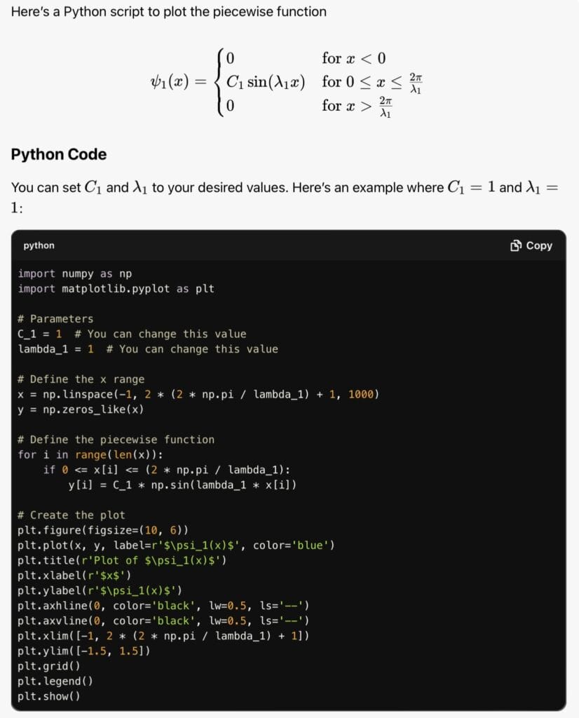
For example:

And the LLM kicks out a bunch of python code:
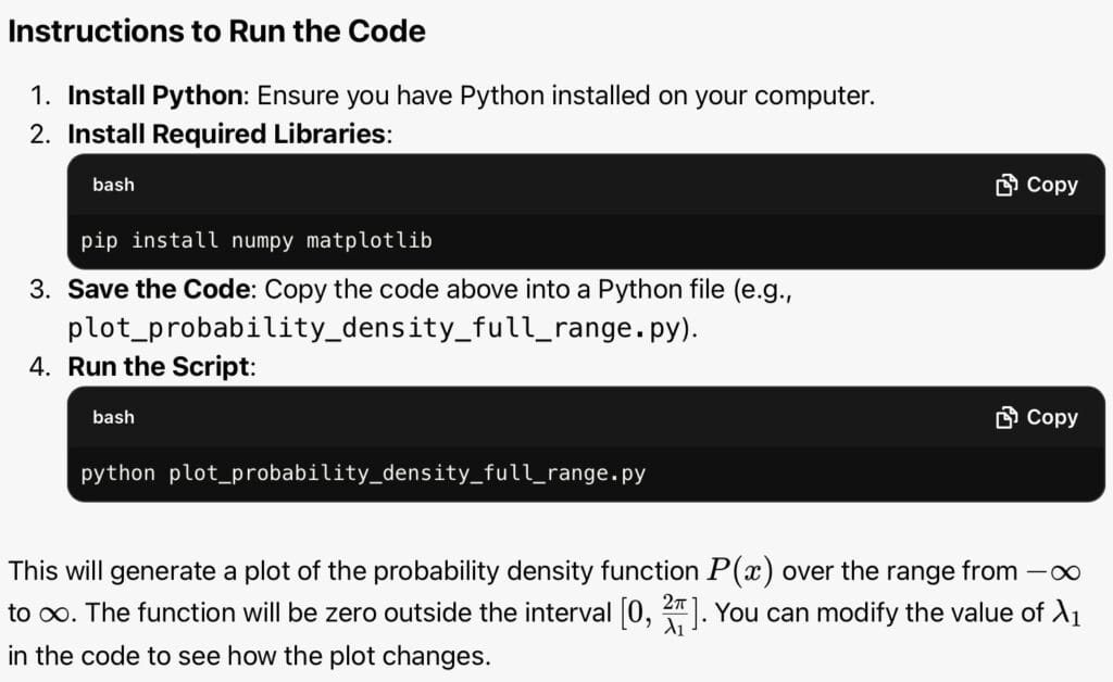
Along with instructions on how to execute:
Tool 2: online python environment
Which brings me to the second tool – an online python environment. I used https://python-fiddle.com/examples/matplotlib.
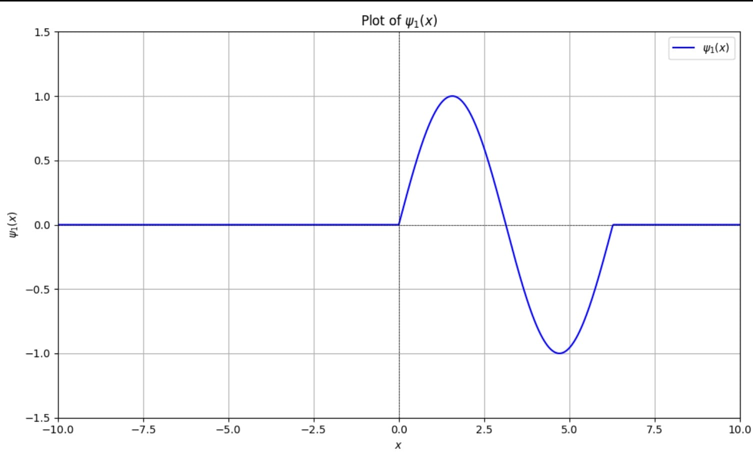
Just throw in the python code and it spits out the plot
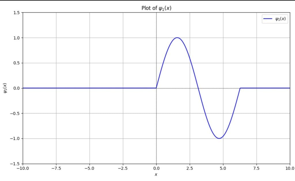
Neat, right?
And in the code I can change the values of and
to see the impact on the wave function.
Tool 3: Powerpoint to explore axis
Of course, the labelling on the axis are specific to the code, and so could do with some interpretation. Here’s where I try and consolidate my learning.
Here’s another plot – this time the probability density function of the above wave form. This is something I had to work out myself by taking the square integral of the waveform and normalising to find the constant .
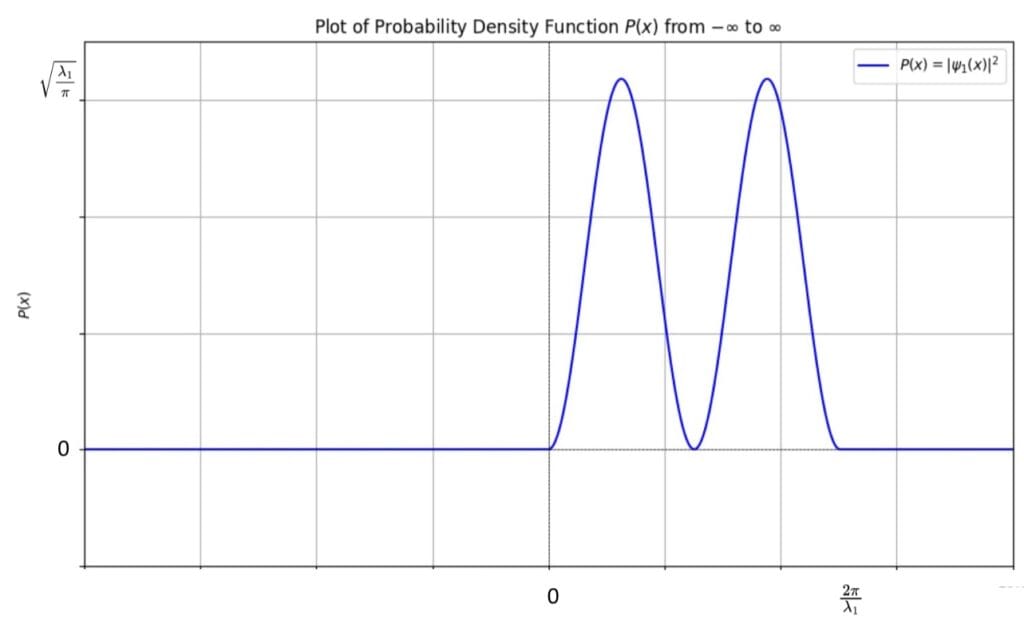
I used powerpoint to draw on key points of the axis, ie the origins as well as the peak and ranges of x.
The last word…
Using AI and these tools really helps consolidate knowledge my knowledge through cheap exploration. Not least being able to see how wave functions and probability densities relate.

Let’s get entangled…